Binghamton Philharmonic Orchestra
Brand Identity
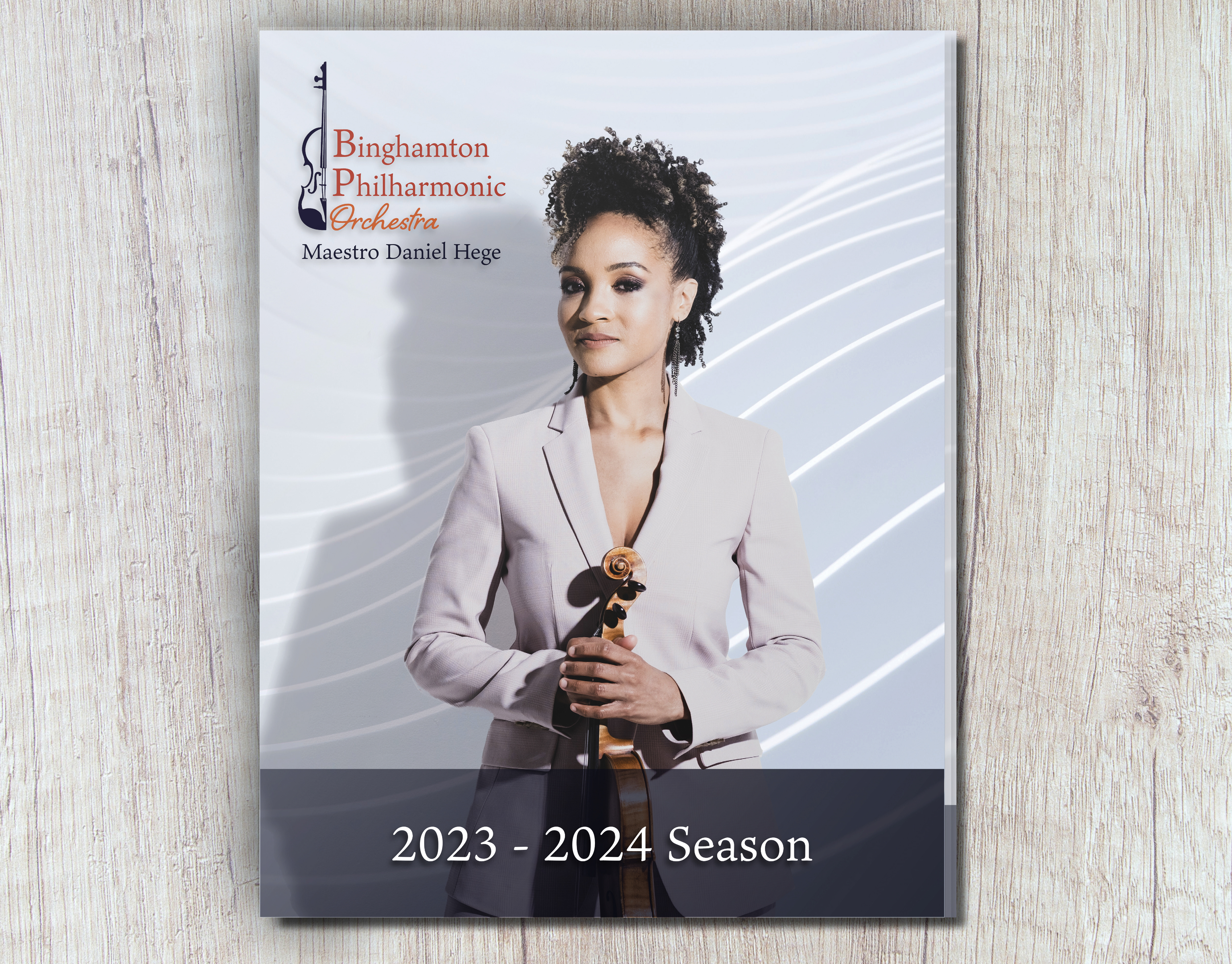
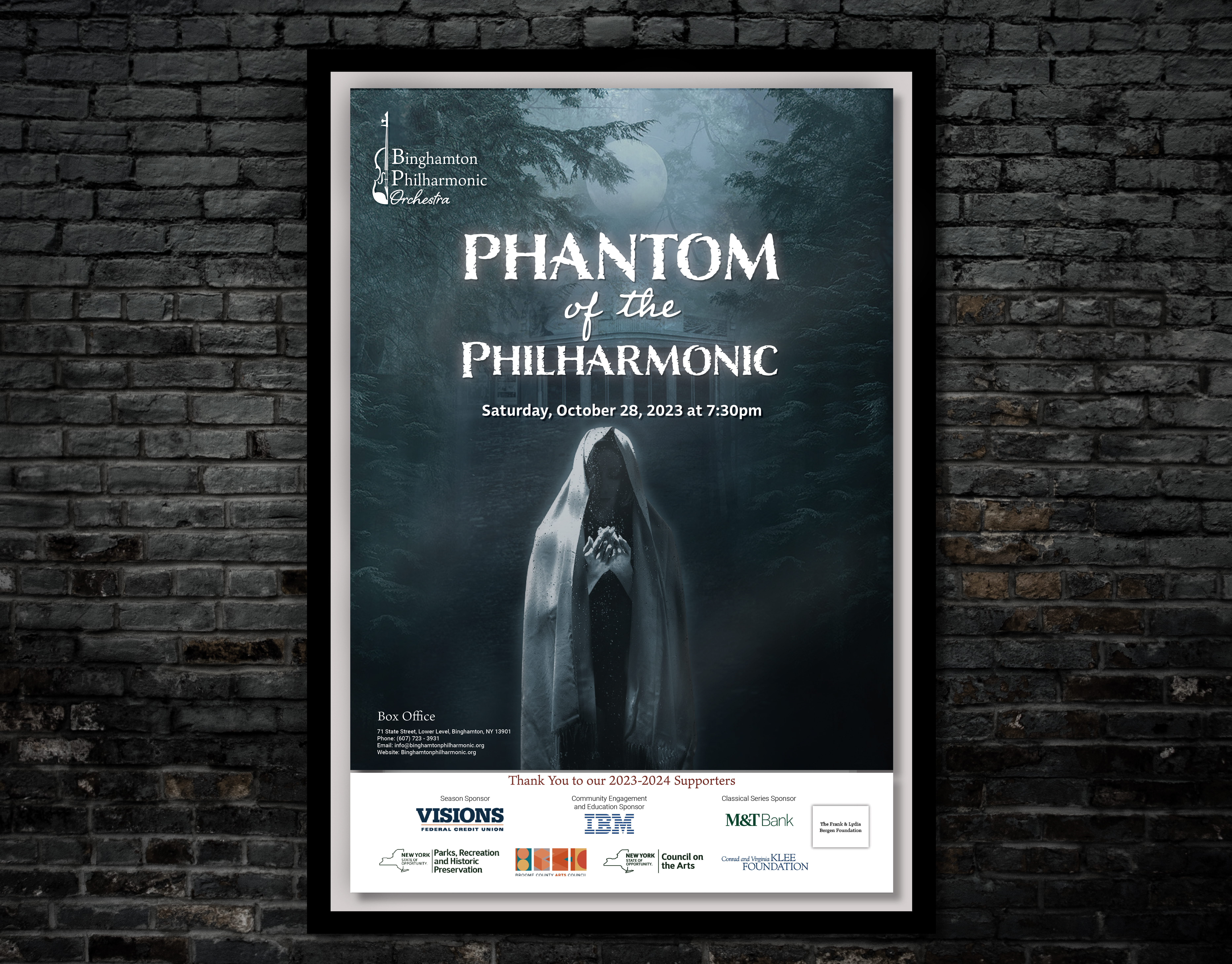
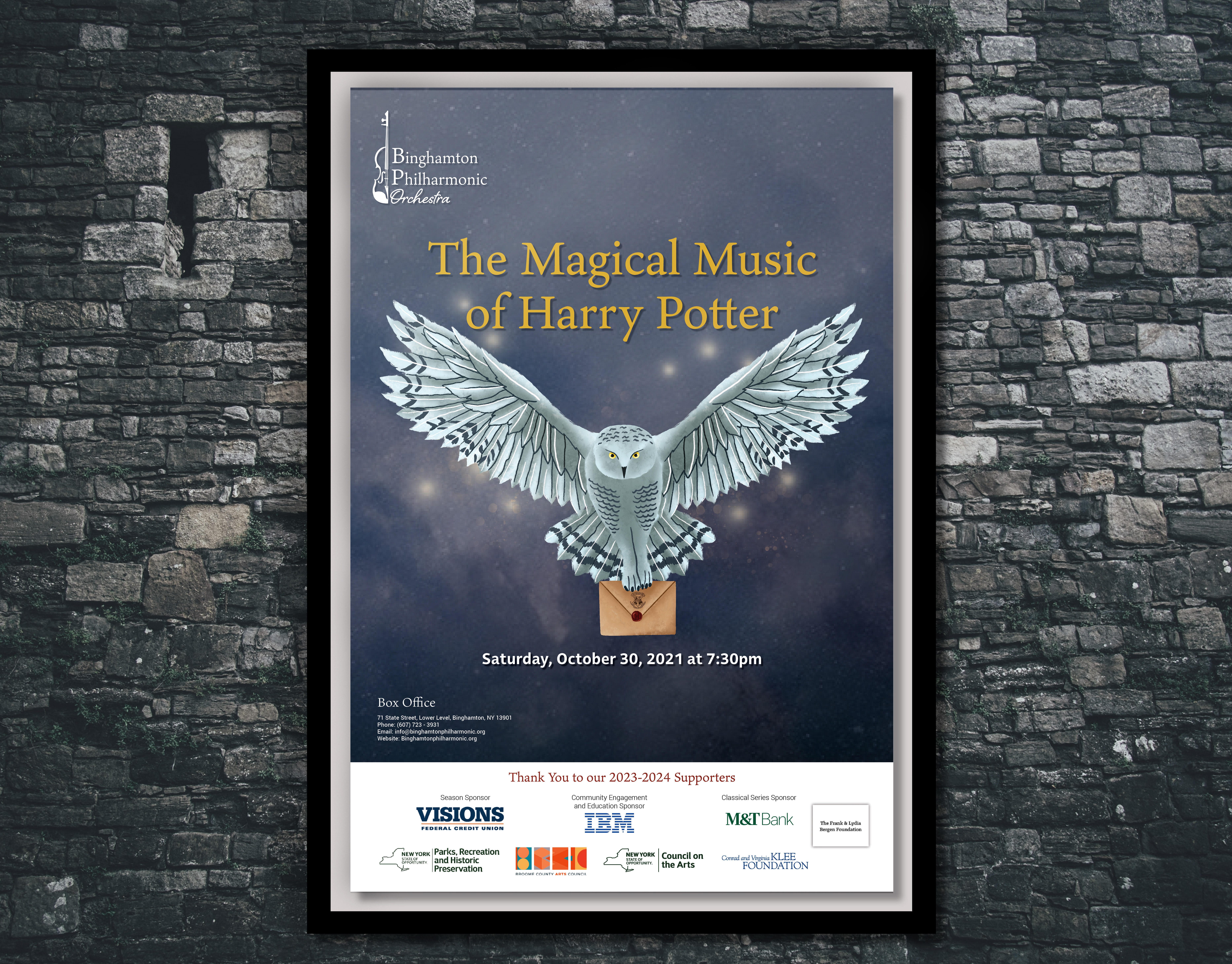
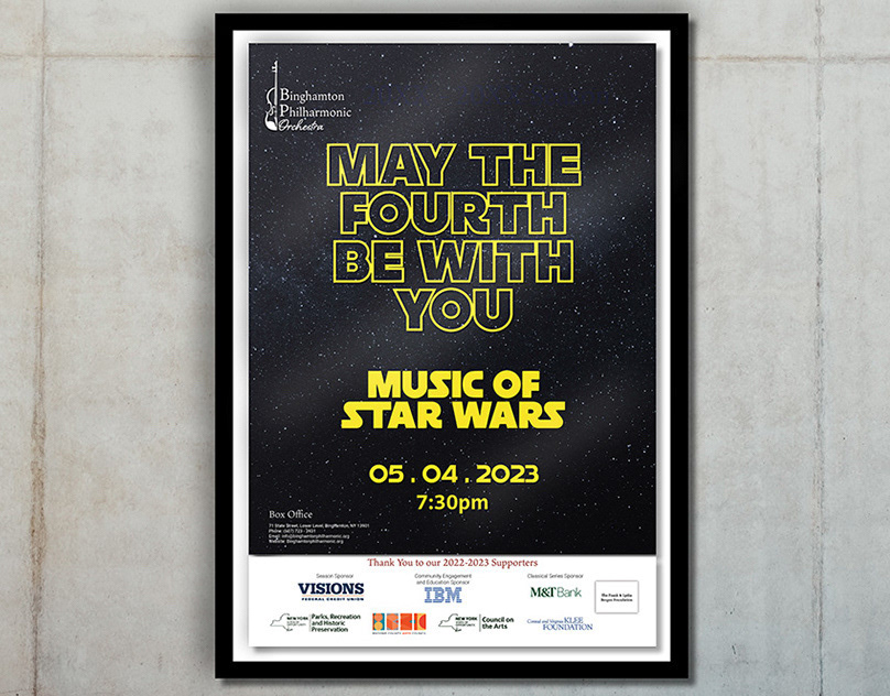
I was commissioned to create a new brand for the Binghamton Philharmonic Orchestra as the current branding was over ten years old and extremally dated.
I started by doing marketing research and gathering logo inspiration from other orchestras.
Then I got to sketching ideas on my ipad based on the ideas I found.
I then narrowed down my concepts to a few favorites. I used the font to combine elegance with playfulness. The top design was my favorite, but I wasn't quite happy with it yet. I wanted to find a way to incorporate the violin more seamlessly with the text.
Below is the final design. By cutting the violin in half, it merges more poetically with the text and the curves of the violin reflect the "B" in Binghamton.
Background
Founded by Fritz and Marianne Wallenberg in 1955 at the Binghamton Symphony and Choral Society and later merging with the B.C. Pops, an orchestra founded by David Agard and Russell Hawkes, the Binghamton Philharmonic Orchestra presents an annual series of classical, pops, and chamber music concerts in Downtown Binghamton and throughout Broome County.
Concept
Inspired by the movement of soundwaves as the orchestra performs, the Binghamton Philharmonic Orchestra visual concept revolves around the transformational effect of music. A marriage of elegance and approacability, the logo represents the heart of the philharmonic as a pillar of the cultural community of Binghamton. The violin is the instrument most recognizable in conjunction with an orchestra while simultaneously reflecting the “B” in Binghamton.
Colors Scheme
Throughout history, people have linked colors to happiness, excitement, anticipation as well as despair. The Binghamton Philharmonic Orchestra branding’s palette is a combination of the playfulness and refinement experienced in every symphony concert. The colors reflect the talent of the musicians and the friendliness of the organization as a whole.


