Pottery Website Redesign
Project Overview
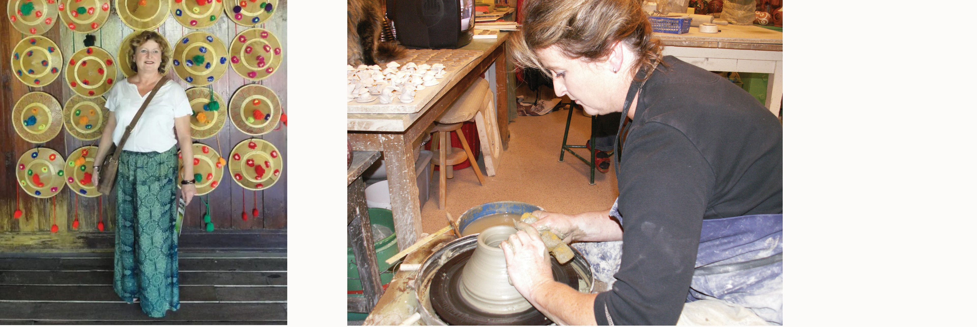
The website we redesigned is for Gertraud Schindelbacher, a highly experienced pottery artist from Austria.
The problem, as we discovered after meeting with the client, is Gertraud’s customer base has grown with her over time. However, as the demographic in her area has shifted to include more younger people, her customer base growth has slowed down considerably. Consequently, she wanted to increase traffic to her website by improving the design and SEO and use the website to bring in more clientele.
Constraints
Some constraints Gertraud has include the inability to ship her pottery due to it’s fragile nature, the lack of tourism in her area, her lack of social media familiarity, and her desire to only be contacted by phone. Unfortunately, the last detail wasn't revealed to us until about half-way through the design process and proved to be a bit of a challenge.
My role
Web Designer
Understanding the User
Client Interview
We met with the client, Gertraud Schindelbacher, early on in the project. Gertaud has worked with pottery for nearly 40 years and lives in Austria. She specializes in Raku pottery, a Japanese style of pottery, and black pottery embossed with silver and golden glazes.
The most important thing to her is for people visiting the website to see and feel her passion for pottery.
She used to do workshops, but stopped when she upscaled to doing more than one exhibition a year. Now that she’s thinking of scaling down to one exhibit a year, however, she’s considering offering workshops again.
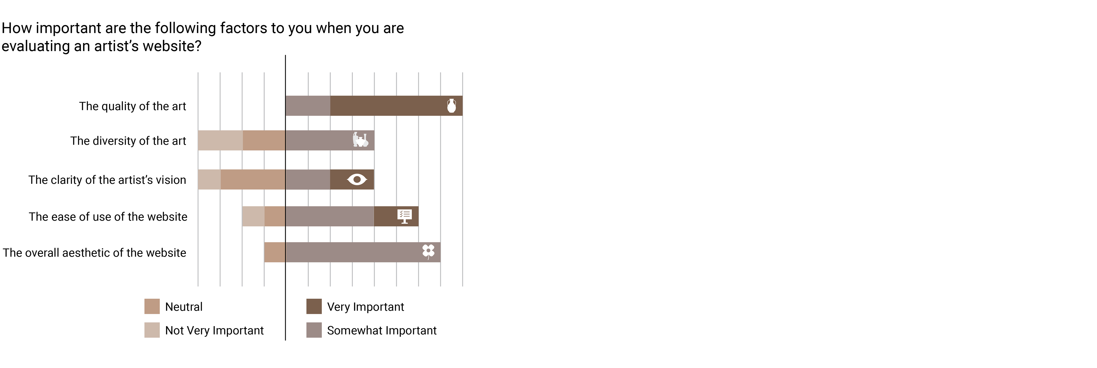
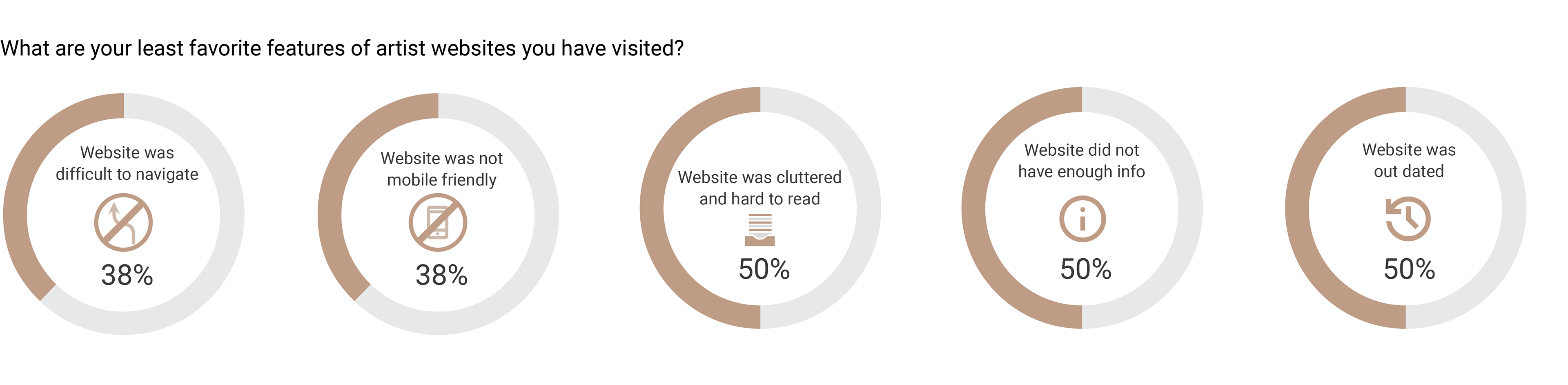
User Research Summary
The research team surveyed a broad spectrum of people geographically due to the language barrier of surveying people in the client’s area of Austria.
The aim of this survey is to understand the experience and behavior of various age groups and ethnicities concerning art and artist websites, specifically for a pottery website UI/UX Design research.
The respondents of this survey represent diverse age groups (15 to 60+ years), genders (male and female), and ethnicities (Caucasian, African or African-American, Other/Unknown). They possess varying degrees of interest in art, from casual appreciation to active creation, and their engagement with art activities ranges from rarely to often.
Survey Responses
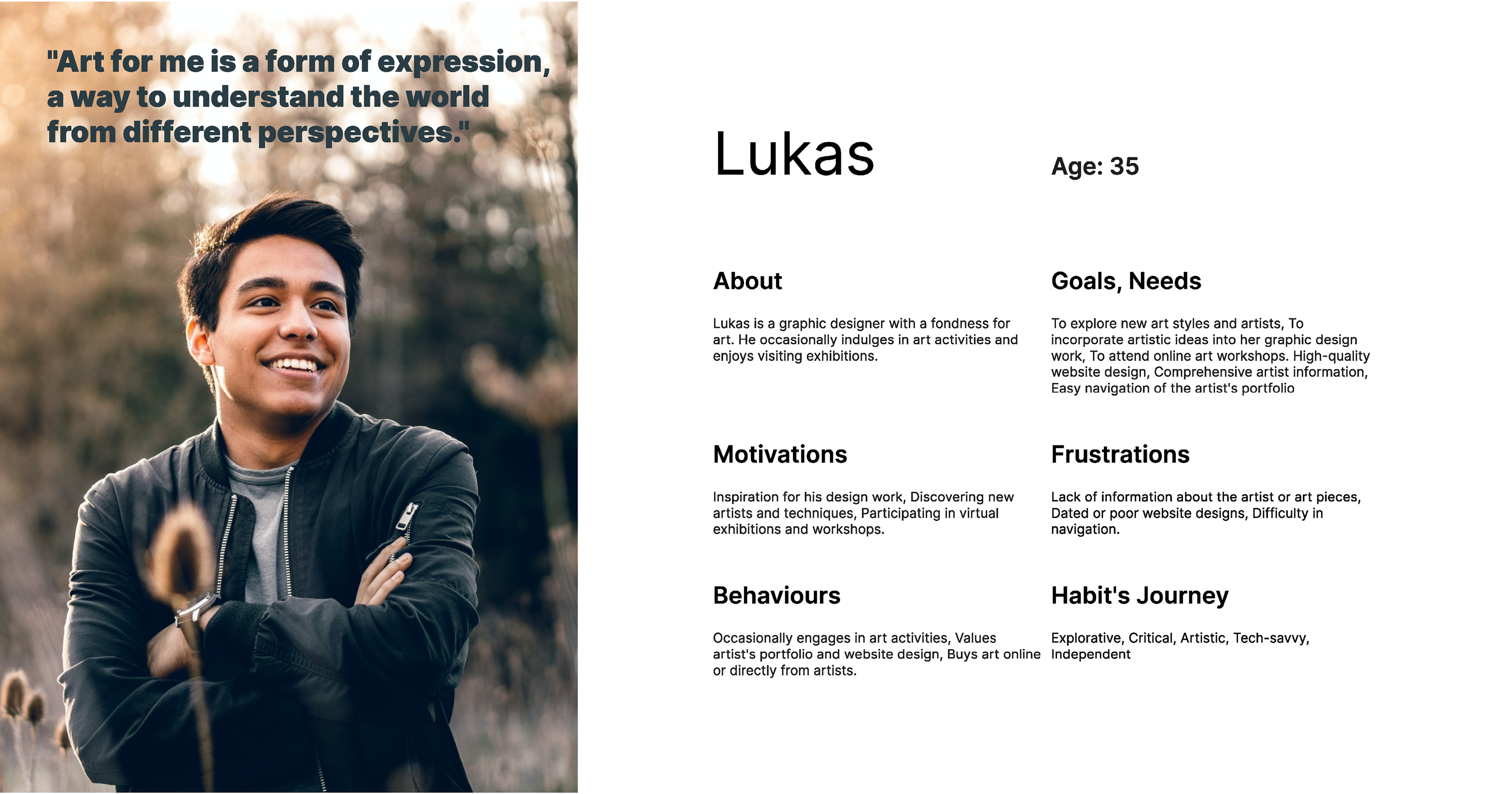
User Personas
We crafted two user personas for this project: one is a designer interested in collecting pottery for artistic inspiration and wants to see exhibition details and the other one is an amateur artist interested in enhancing her skills who wants to see workshop details.
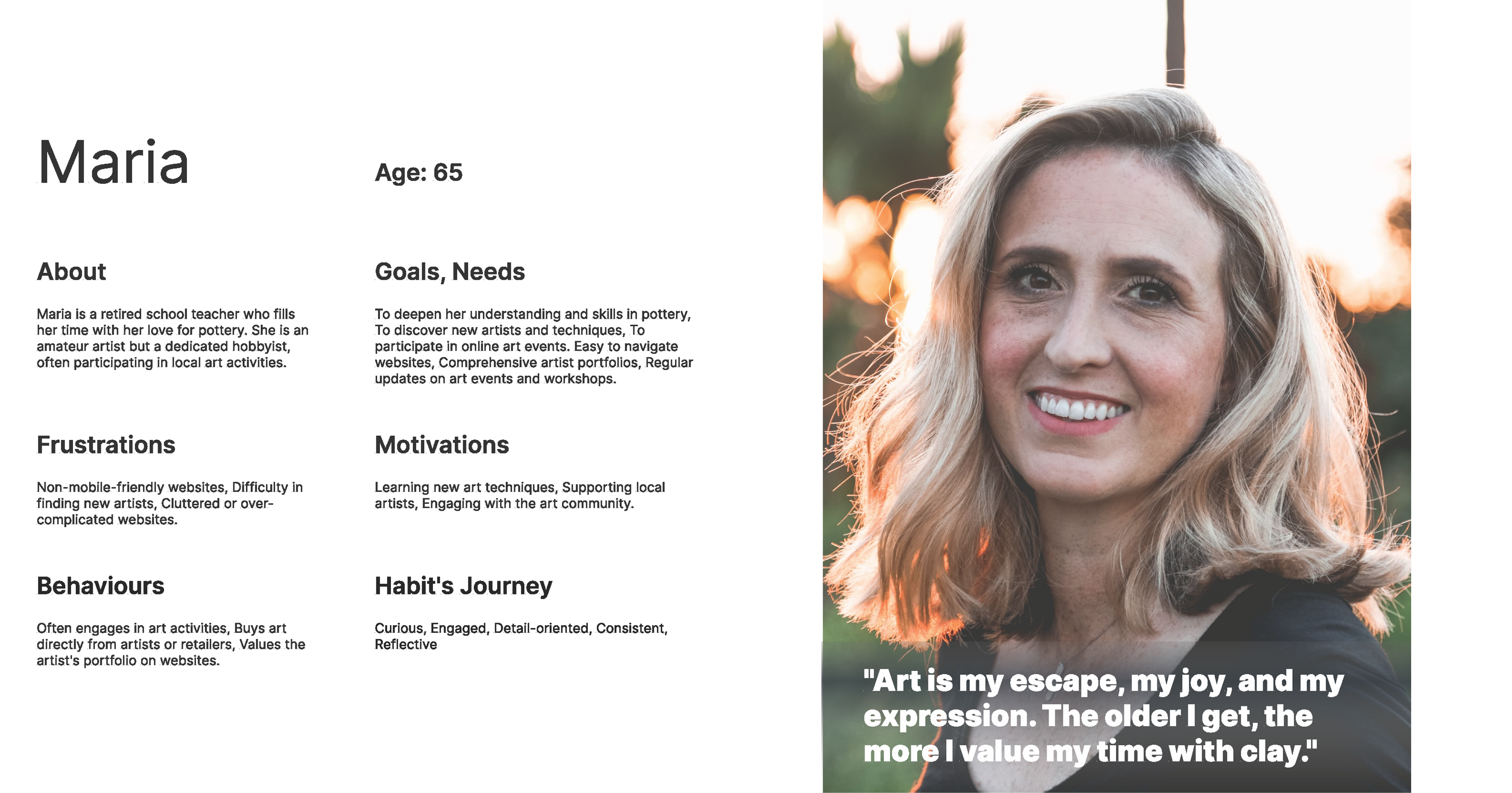
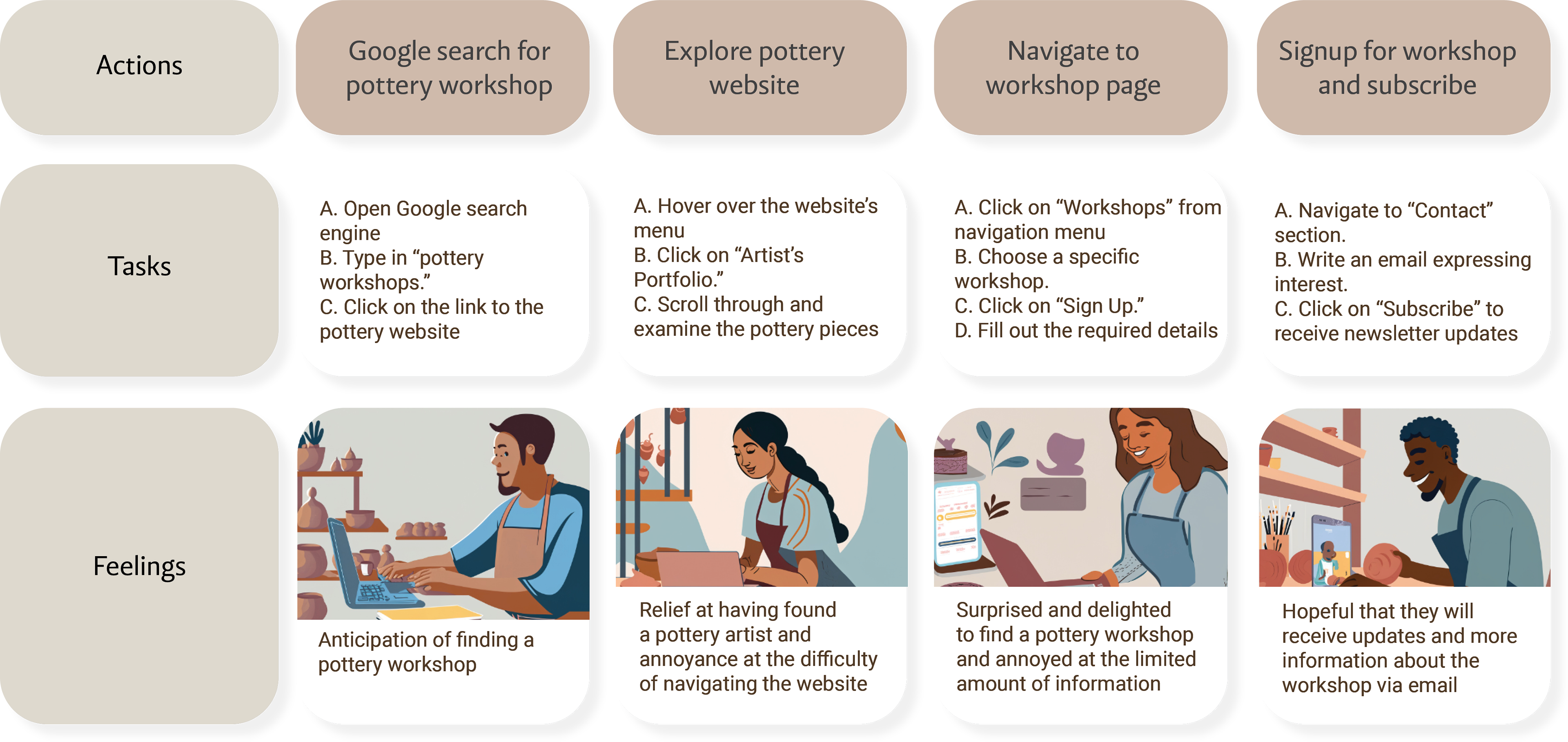
User Journey Map: Maria
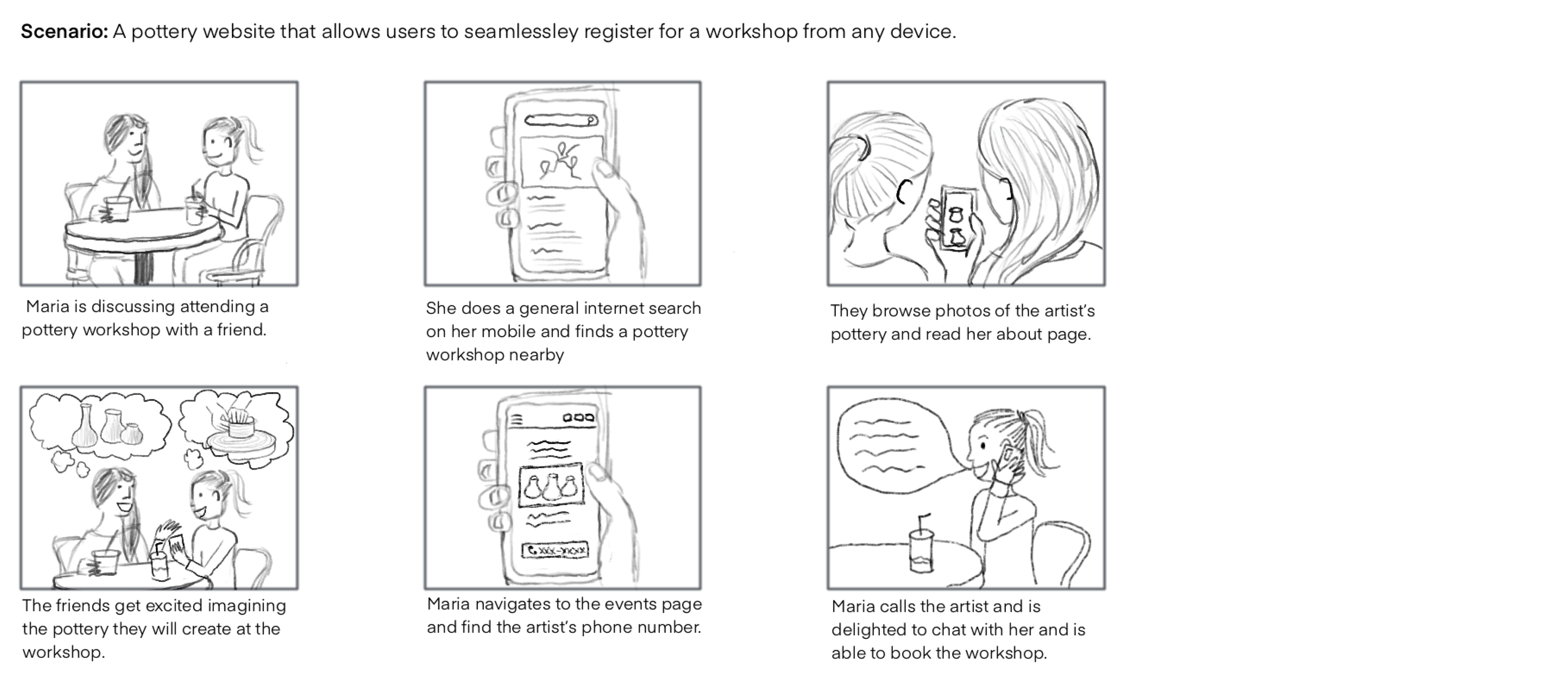
User Storyboard: Maria
To help us better understand our users, we created storyboards for each of the user personas. The storyboards help us realize the challenge of designing a website for a client who doesn’t use email and only wants users to call her.
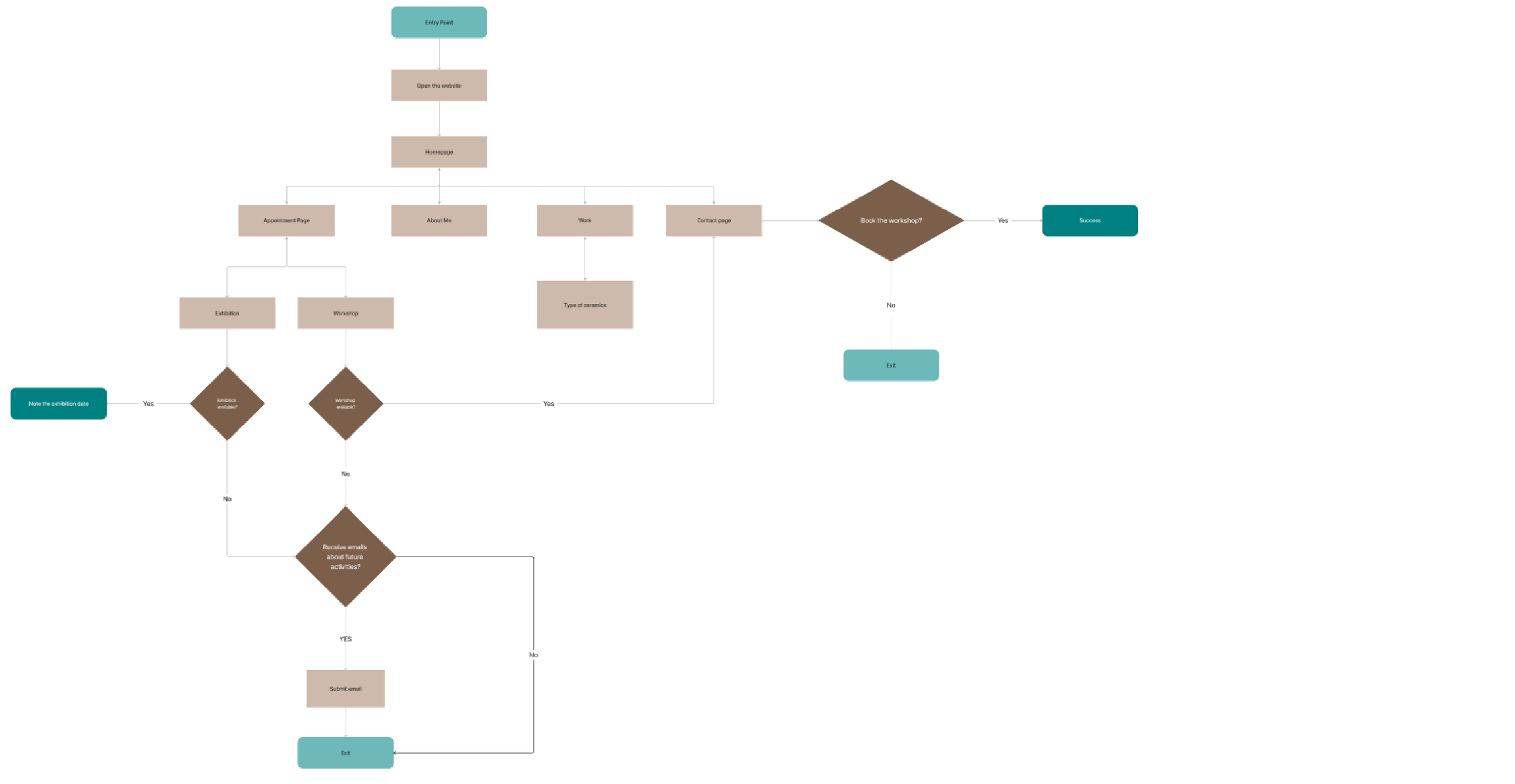
User Flow
We created a user flow of booking a workshop or attending an exhibition. While creating the user flow, we realized that if there weren’t any upcoming events, the user would have an unhappy user flow. We then created a newsletter signup so the user could receive an email when the artist set a date for her next event.
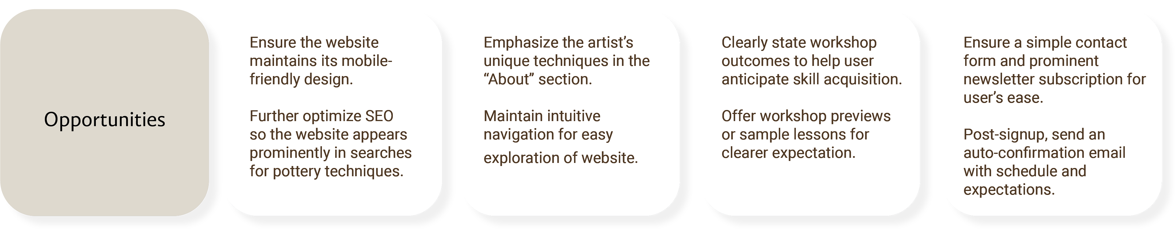
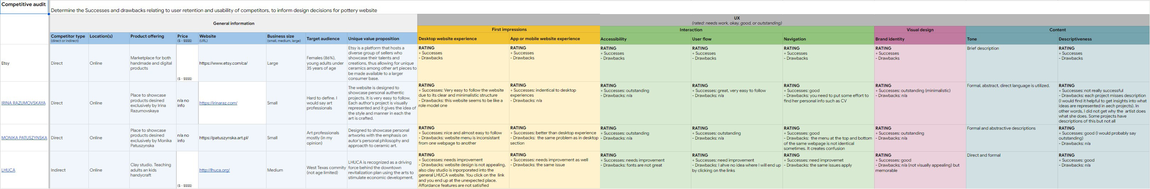
Competitive Audit
We conducted a competitive audit on several pottery websites. One challenge we faced was that most pottery websites are either a portfolio websites or an e-commerce website where as our client’s website is a website that informs users of upcoming events.
From the competitive audit, we discovered the following opportunities:
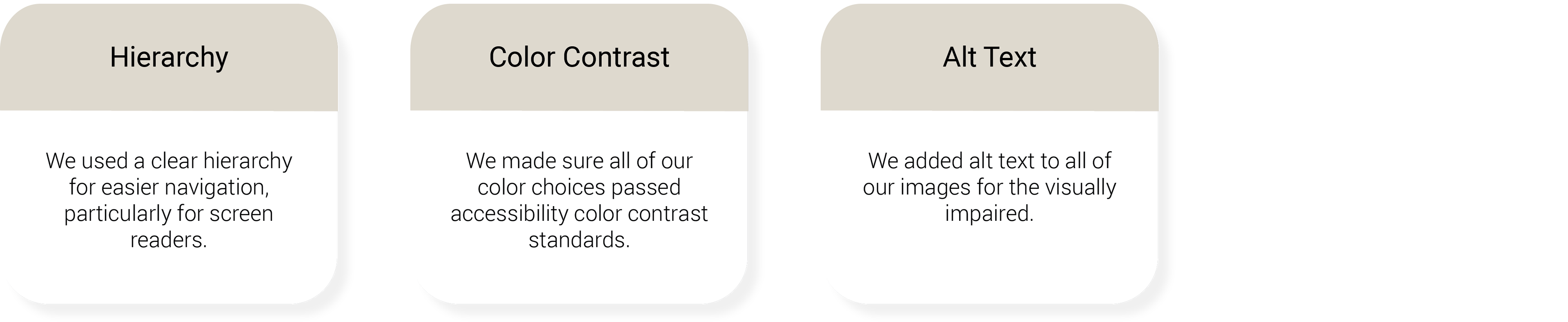
Accessibility features
Language options
High contrast colors
Clear hierarchy
Alt text on images
Incorporate a visually captivating homepage
‘About me’ page with good storytelling
Starting the Design
Ideation: Crazy Eights
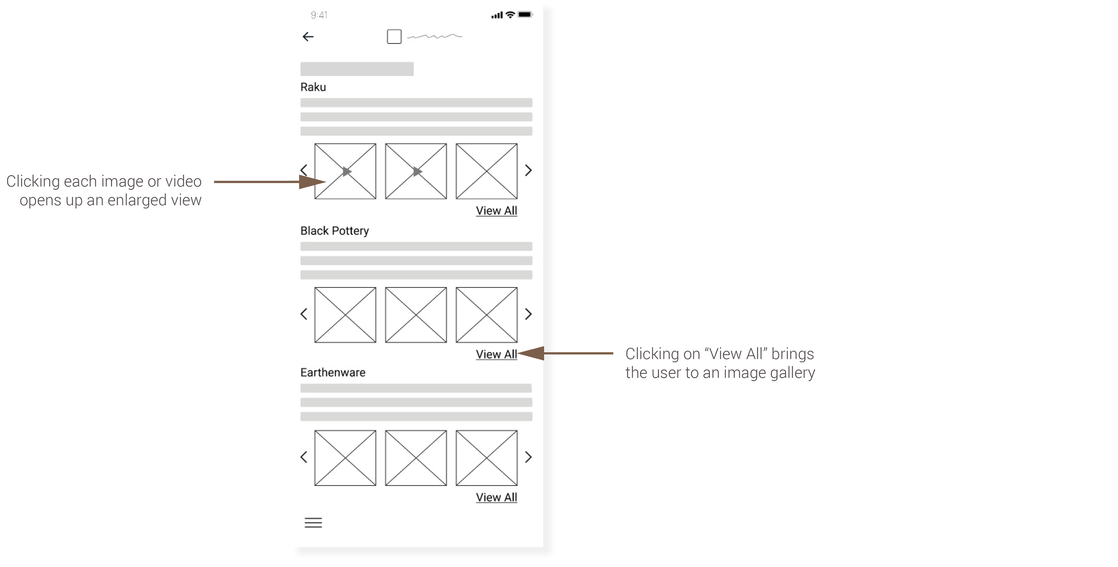
The design team conducted several design iteration exercises including crazy eights. While drawing my crazy eights, I came up with several ideas for the mobile website that helped save space including photo carousels, using tabs, and links to other pages for additional information.
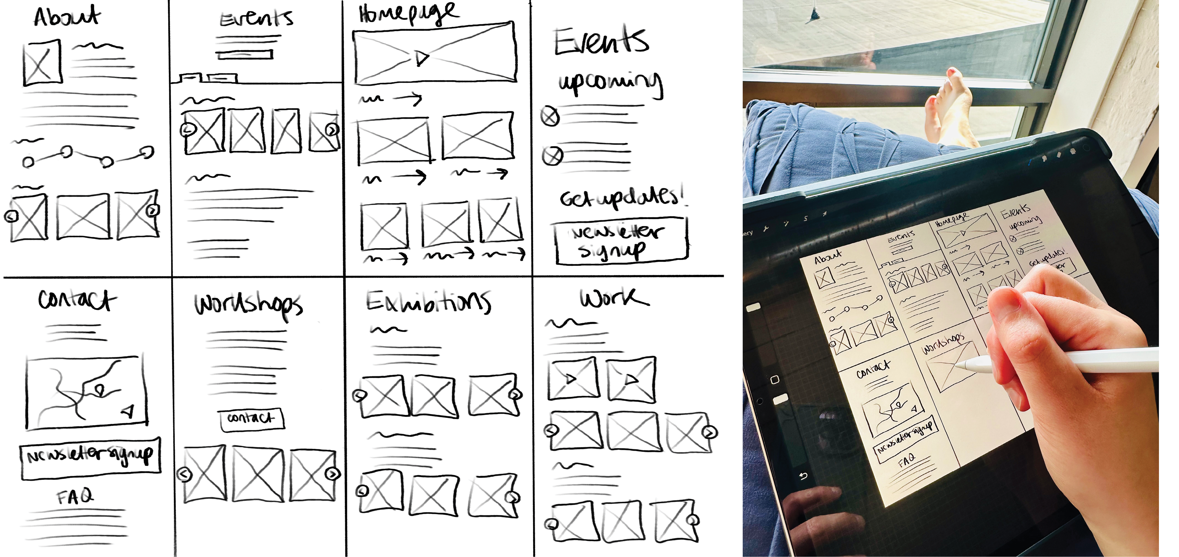
Paper Wireframes: Mobile
Each of the designers created a set of paper wireframes for the mobile website and then came to a consensus of which ideas we liked best.
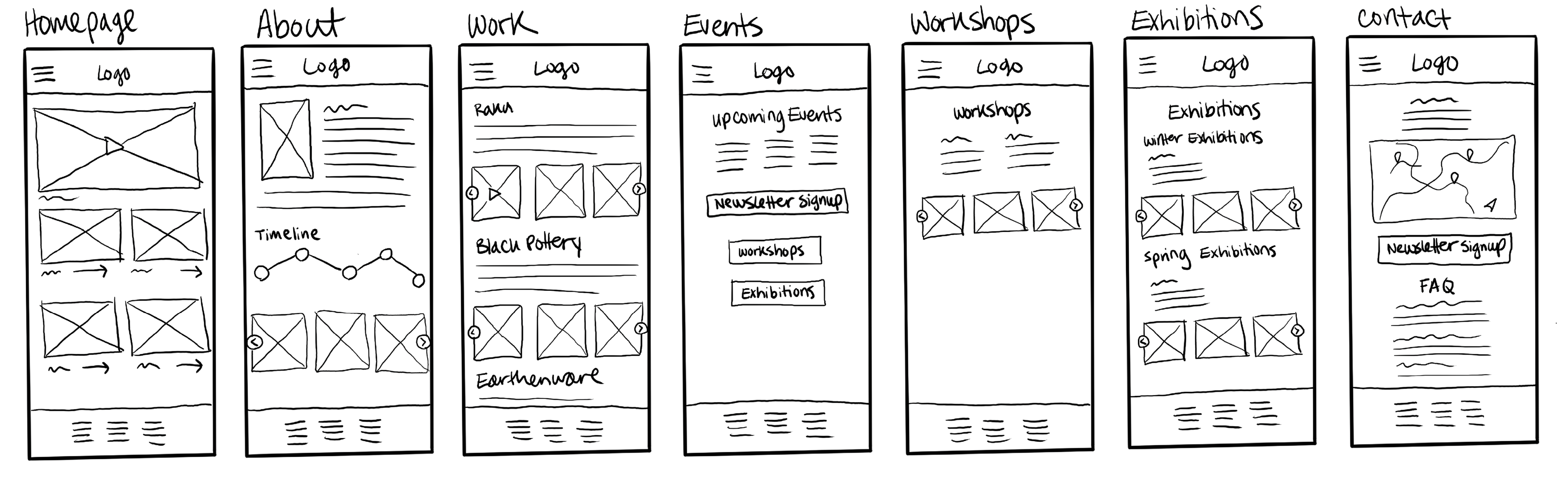
Low fidelity Wireframes: Mobile
While creating this wireframe, I attempted to fit everything within the confines of the screen, but realized that the items are too close together. There needs to be more distinct groupings.
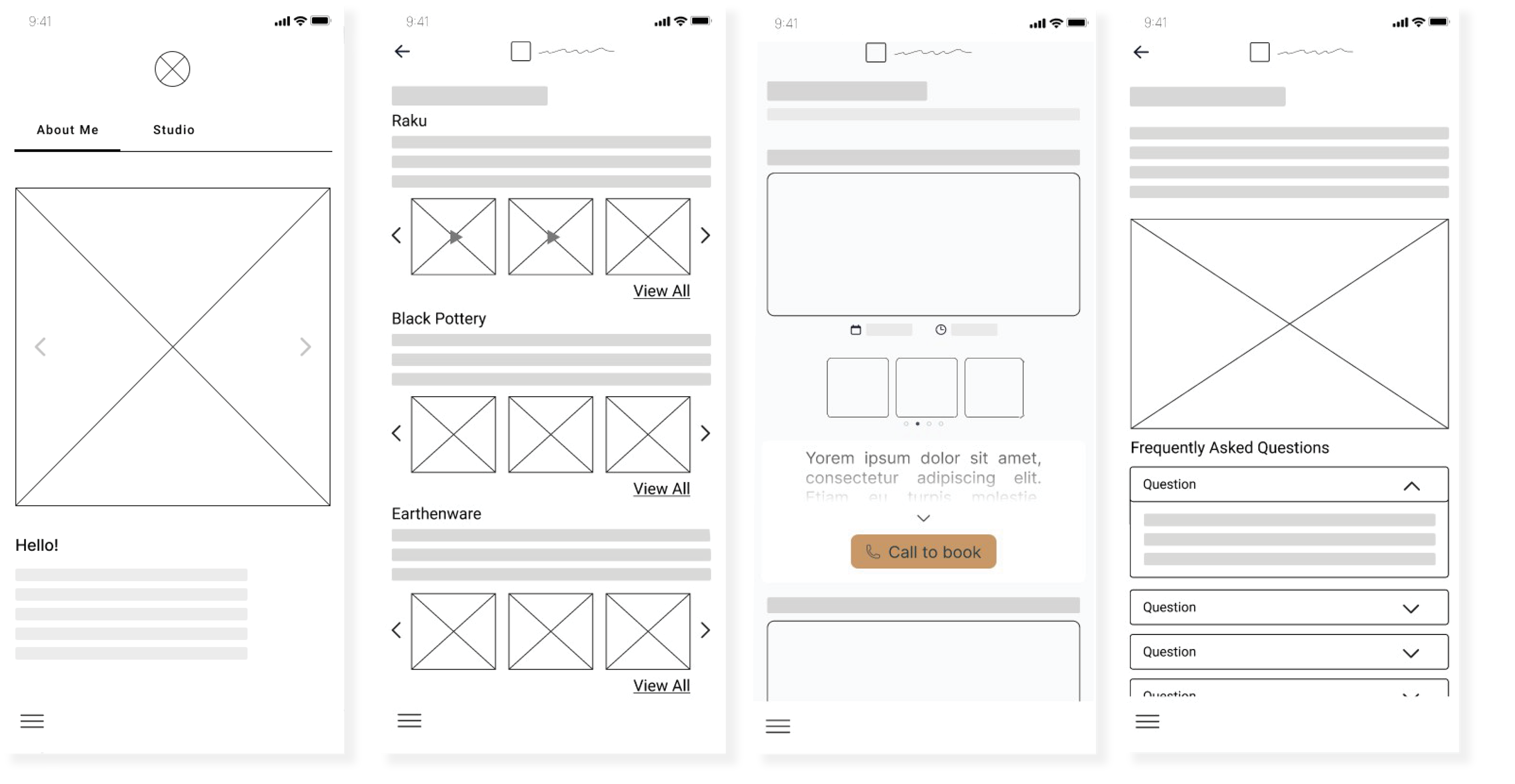
High Fidelity Wireframes: Mobile
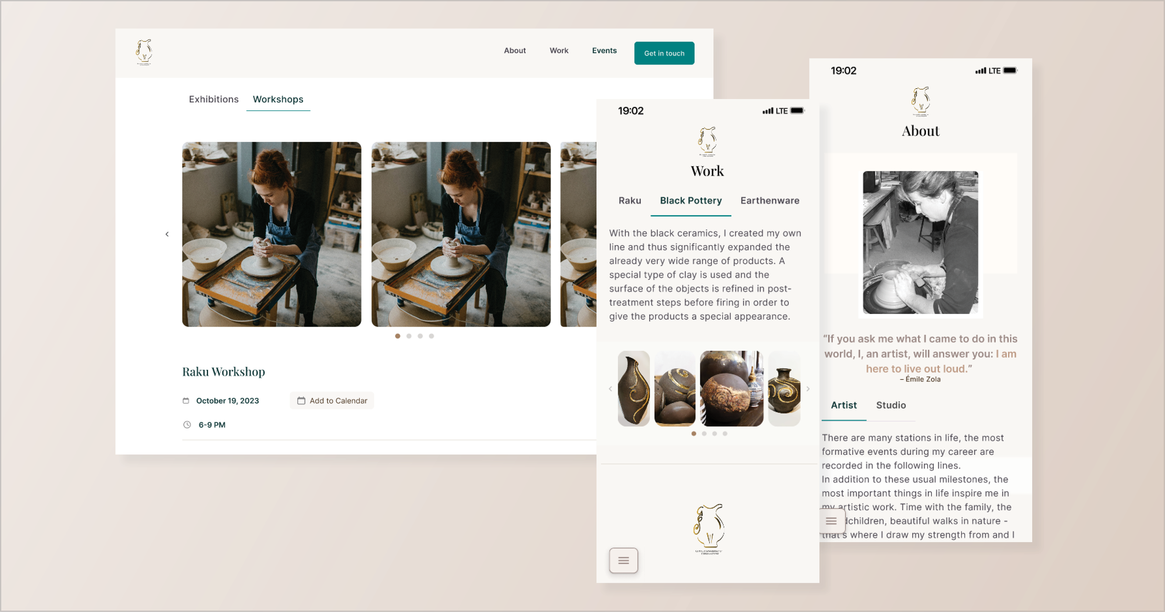
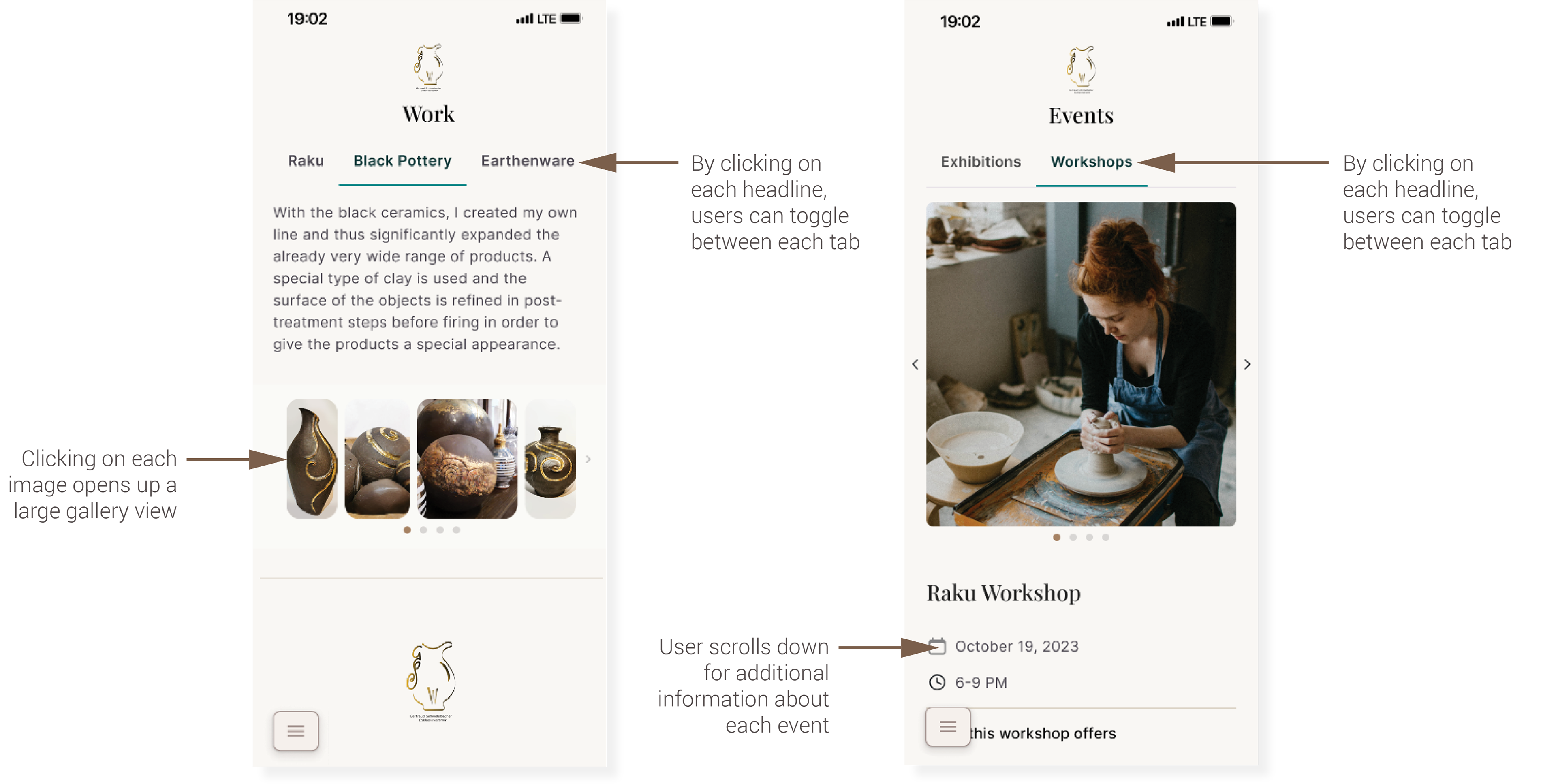
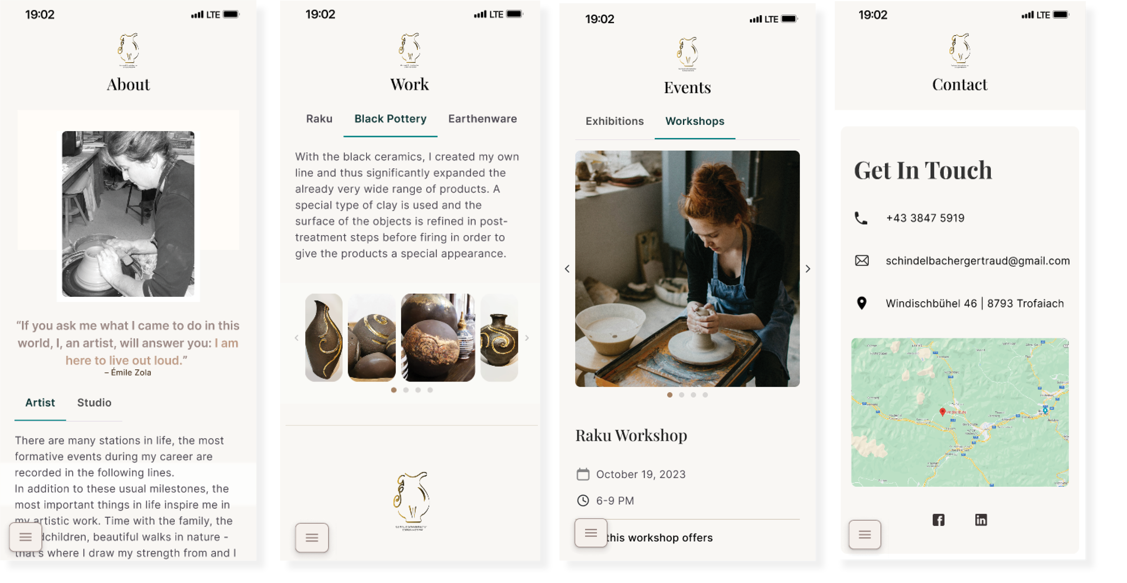
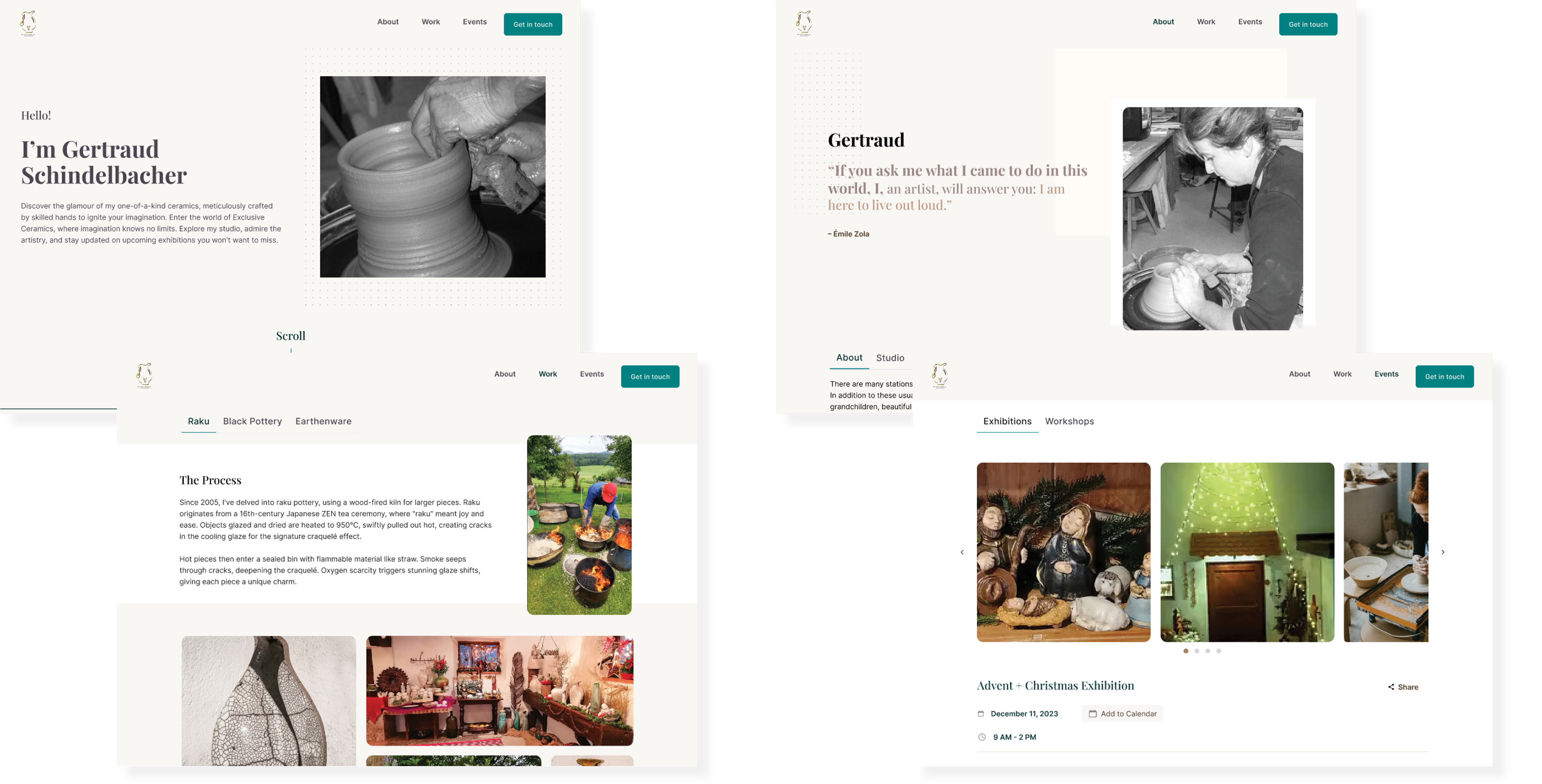
The client has three main types of pottery she creates: Raku, Black Pottery, and Earthenware. We decided to create a tab for each pottery type for easier user navigation.
The client has two main types of events: exhibitions and workshops. We decided to use tabs to make navigation easier for the user.
Usability Study Findings
We conducted a usability study after our hi-fidelity prototype was created to catch any bugs we might have missed.
Refining the Design
Mockups: Mobile
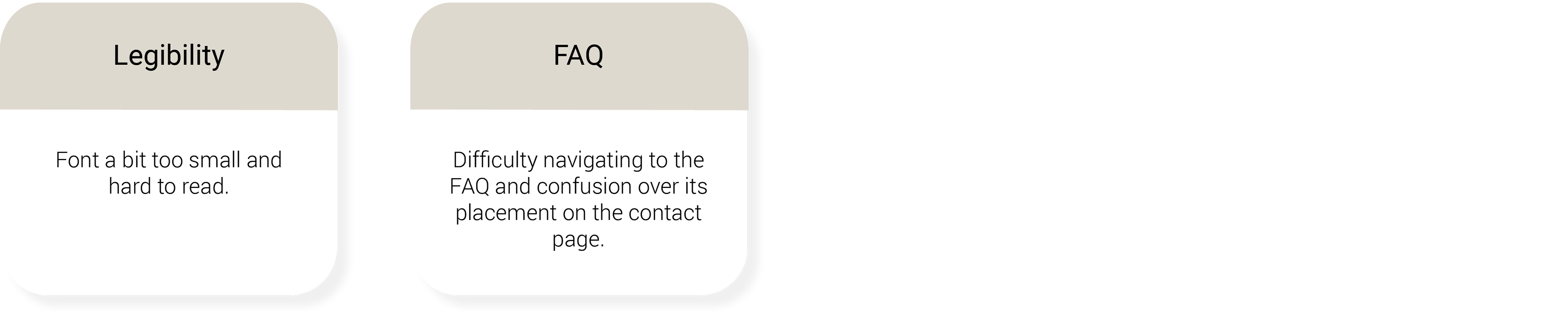
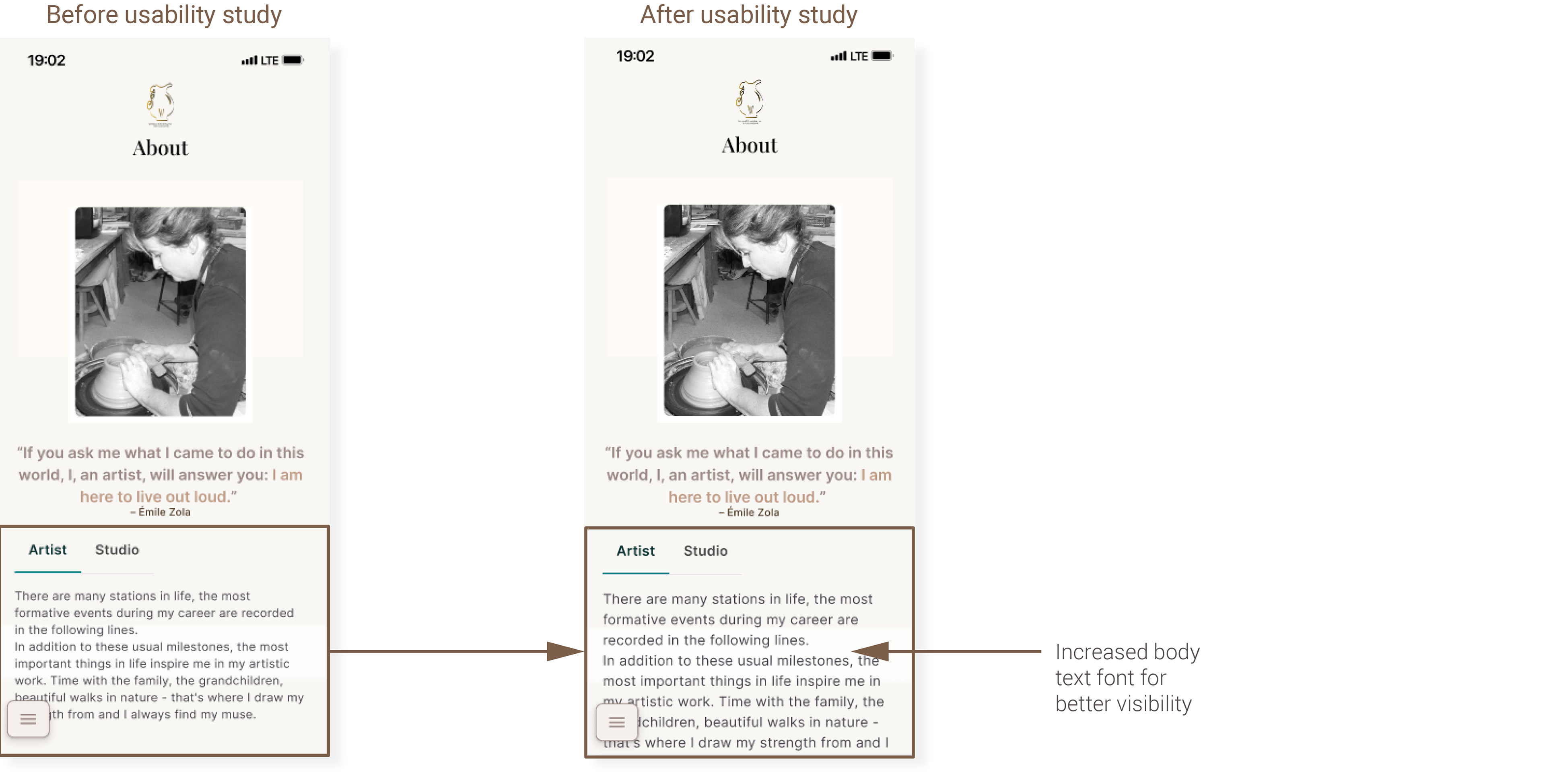
Several users stated that the font was too small to read clearly. We resolved this issue by changing our body font size from 14pt to 16pt.
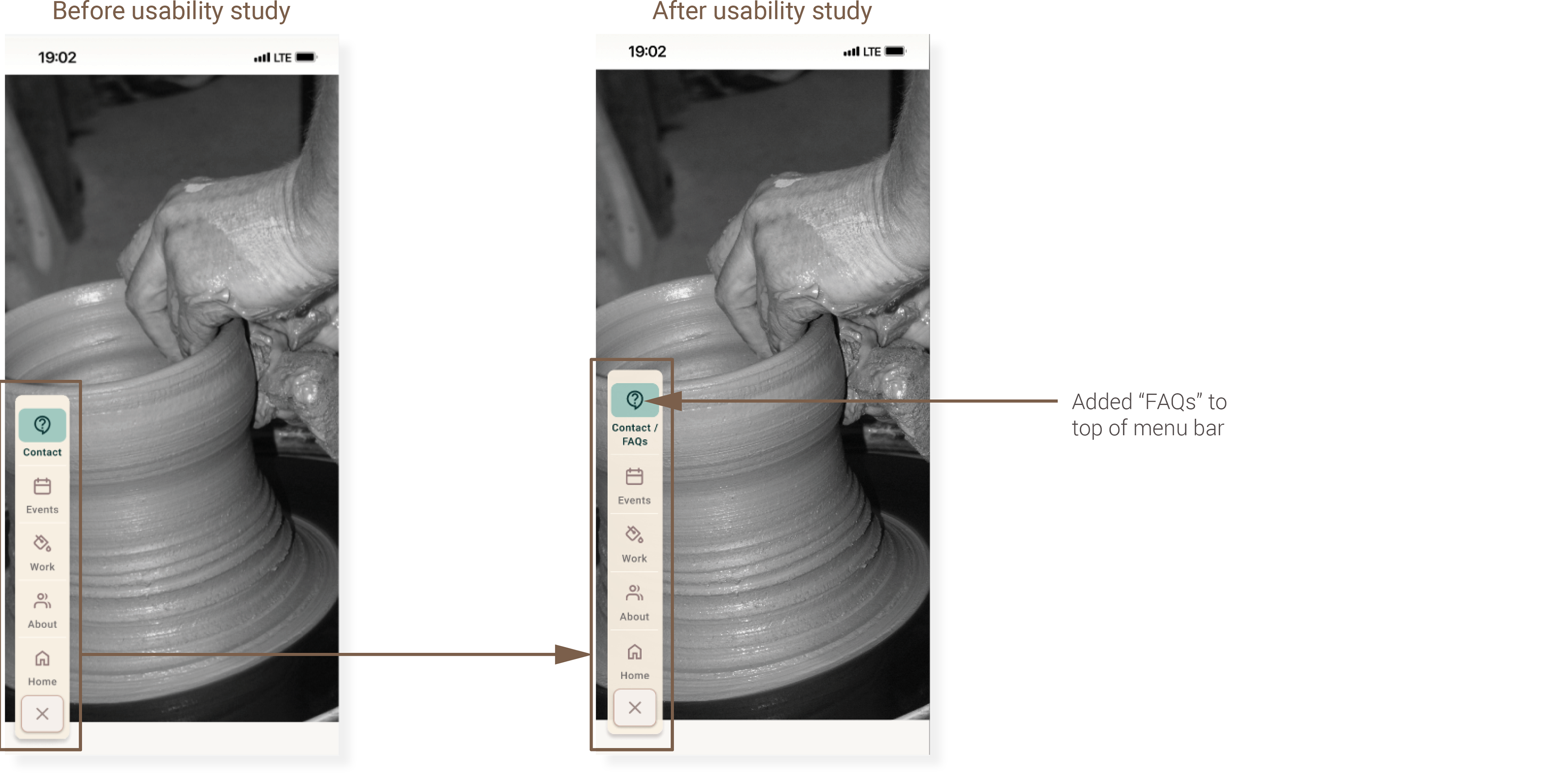
A number of users found navigating to the frequently asked questions difficult. To help with navigation, we added “FAQs” to the menu bar under “Contact.”
High-fidelity Prototype: Mobile
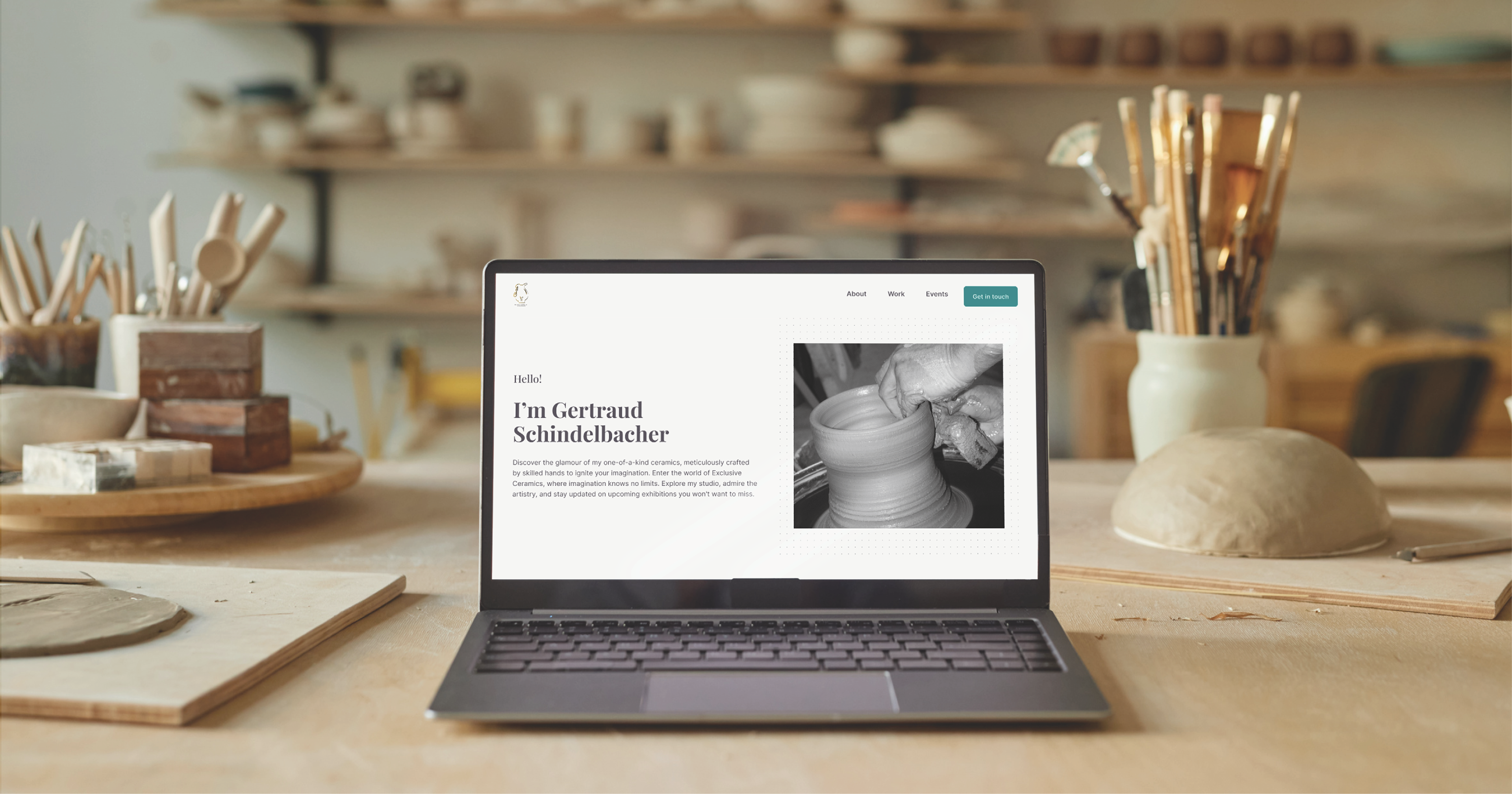
For the high-fidelity prototype, we added soft earthy colors to match the artist’s pottery with a pop of teal for key locations. You can view the hi-fi prototype here.
Accessibility Considerations
Responsive Design
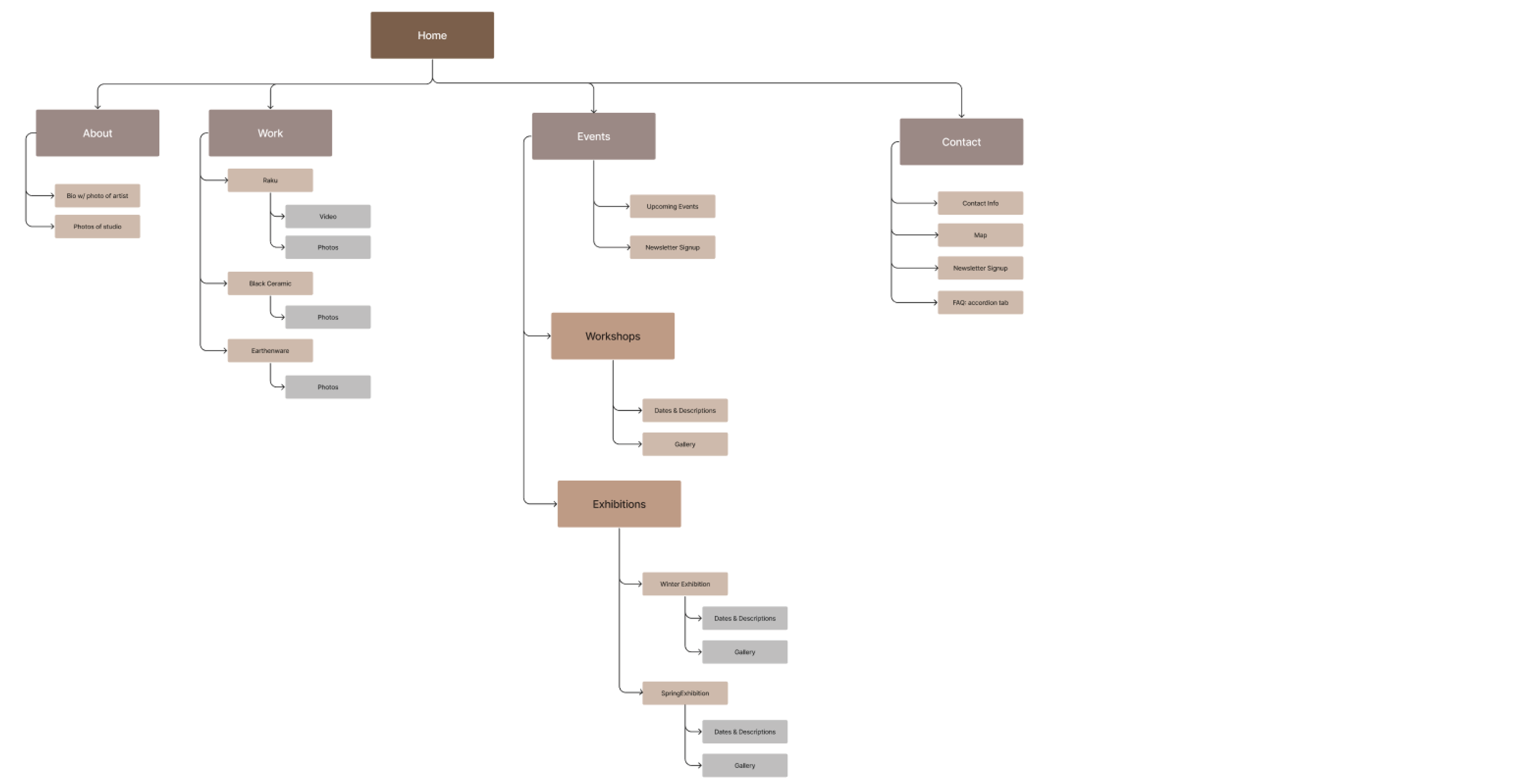
Sitemap
For the desktop sitemap, we used a card sorting exercise to help us organize which elements would go where. One of our goals was to create as few pages as possible and keep the organization as straightforward as we could.
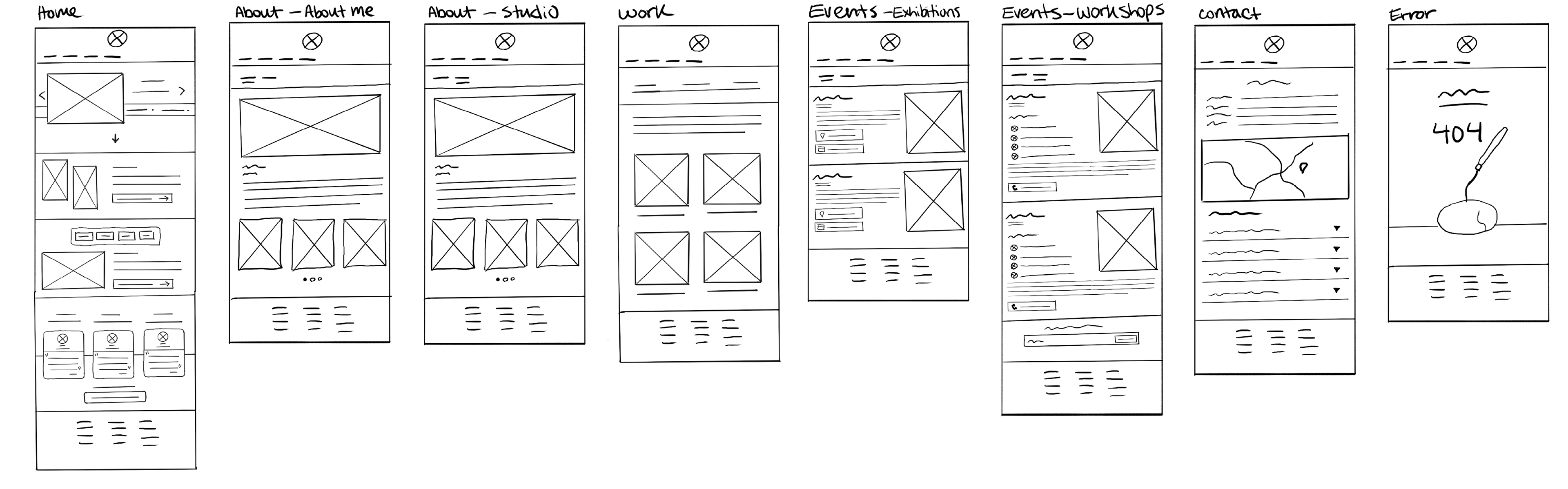
Paper Wireframes: Desktop
We created paper wireframes for each of the key pages for the desktop version. We aimed to keep a similar layout as the mobile version.
Responsive Designs
Where we had used image carousels in the mobile version, we placed larger image carousels or image galleries for the desktop version.
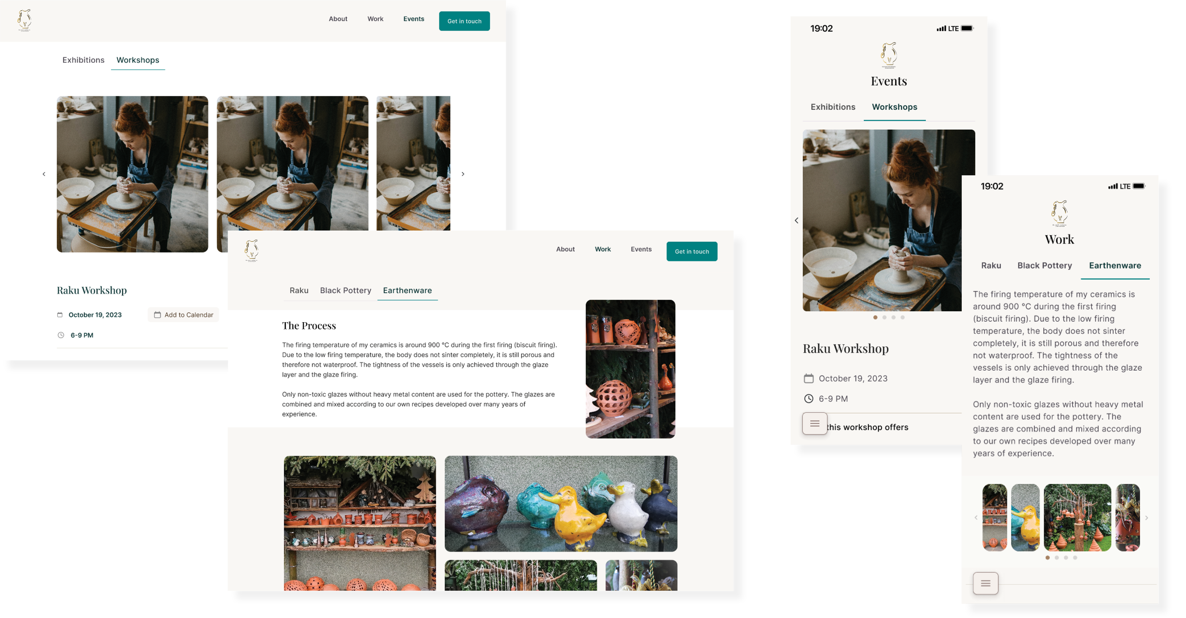
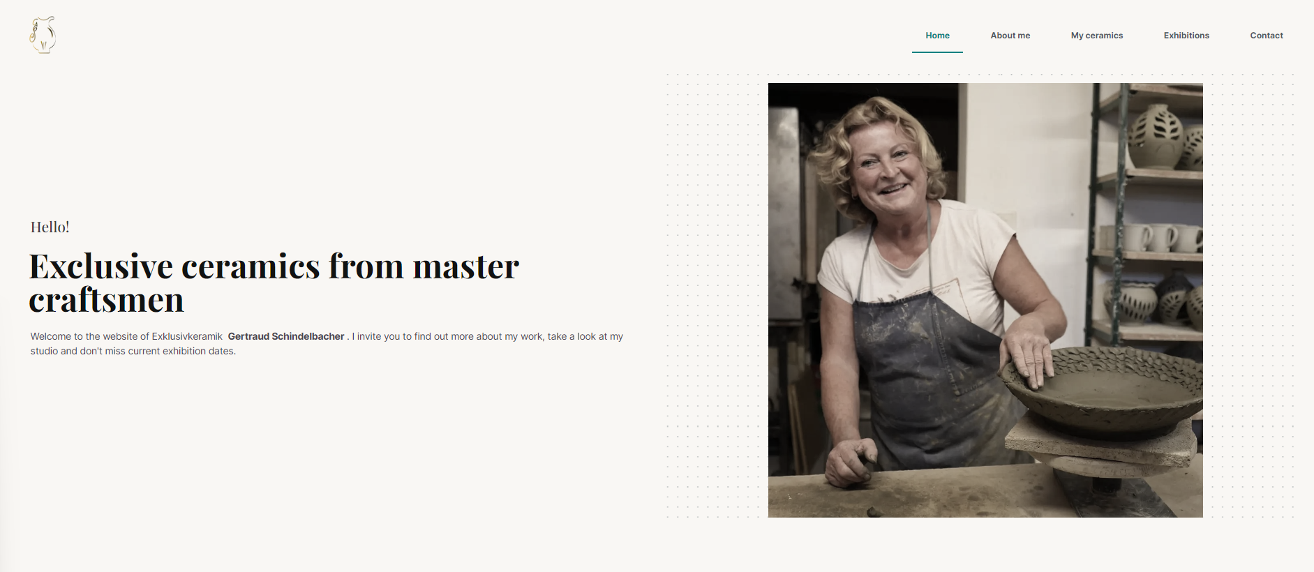
Mockups: Desktop
Going Forward
Impact
As the developers are now building the responsive website, I do not yet know it’s impact. When we showed the client the website design she was very pleased with what we had come up with.
What I Learned
I learned the importance of communicating with the research team at the beginning of the project so that the results they come up with directly tie into what we need to design.
I learned a lot about Figma such as variants and auto-layout and how much I have still to learn, particularly about Design Systems.
I learned that it's helpful to start figuring out your design system at the beginning of the design process so that it's mostly figured out by the time you start designing your hi-fi wireframes.
I learned that it's helpful to start figuring out your design system at the beginning of the design process so that it's mostly figured out by the time you start designing your hi-fi wireframes.
Thank You!
Thank you for your time reviewing my work on the Pottery Website Redesign. If you’d like to connect with me or view more of my work, my contact information is provided below:
Email: caitlinkhan8@gmail.com
Website: www.caitlinkhan.com